Beginnings, middles and ends, but not necessarily in that order:
Making connections: Bringing complex data and insight to life for EY
The world is complicated. Possibly uniquely amongst animals, humans make medium and long-term plans which rely on mapping that complexly interconnected world. We use many overlapping ways of understanding these connections in order to make predictions about the outcomes of complex systems.
Global business advisors EY mapped-out connections influencing the behaviour of consumers to enable them to build a vision of the future consumer - what the consumer of the near, and not-so-near future will look like. This deeply researched and fascinating approach offers insights, new directions and new understanding. It is building EY's position as market leaders in the Consumer sector.
But how do you bring this complex and interconnected data to life?
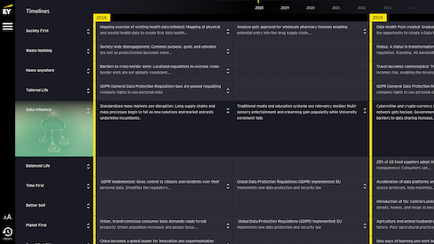
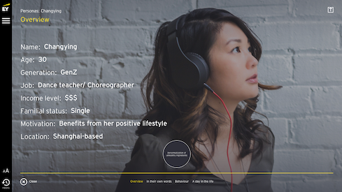
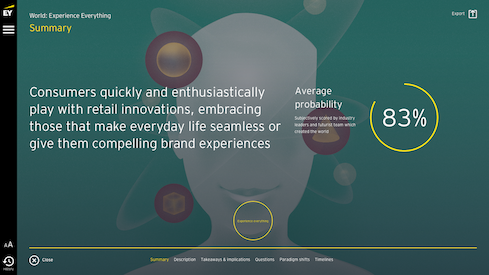
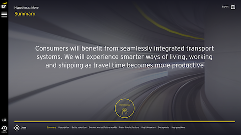
We pitched, then developed a dynamic, interactive tool that allows EY practitioners to dive into the content, and tell compelling stories to their clients and colleagues. They can take any journey they want, starting wherever they want, and showing the links between the different personas, worlds and ideas.
EY FCN in action
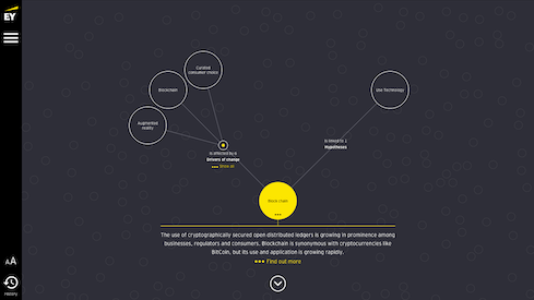
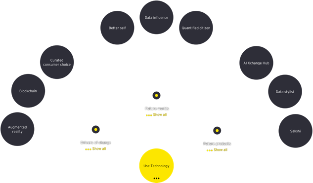
The interface starts with connections to the future Smart Consumer, and allows us to dive into the detail of how brands must prepare
A unique touch interface
We always design with the end user in mind, and for EY we were keen to take advantage of their global network of wavespaces - hubs designed to deliver interactive, impactful and transformative experiences for clients. In these spaces, they had huge touch-screen displays where EY practitioners could guide clients around the world of the Future Consumer, creating discussion points and fluidly responding to questions and concerns.
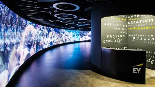
Wavespace, Madrid
The interface is often rendered on these huge displays, in facilitated, "lean-back" conversations with many people at once. The design must be impactful and simple, with low information density per screen
We designed a beautiful interface, showing the many connections between the products, personas and worlds of the future consumer. Menus are stripped back and simple, while hinting at the depths of connection below. Sophisticated animation draws the user through the connections and provides subtle hints for where to go next.
The design challenge
It was important to wow those watching a trained EY facilitator swiping and dragging content and connections on the screen. The interface needed to be slick and beautiful, providing an impactful “lean back” experience.
We were all keen to avoid the “Minority report” clichés of Hollywood-style display interfaces, and it was important for the tool to be clearly EY branded. Instead we focused on a limited, bold colour palette, rich, human photography and a simplified set of display patterns, into which we could pour the content, small amounts at a time. The result is a design that can flex and grow with new and different content, while maintaining its composure.
Navigation
Entities are linked through animation, placement and connecting lines
Data. Managed.
With such a lot of data, and more coming in all the time, we built a bespoke Content Management System to allow any part of the system to be updated and refreshed. This means the tool is able to keep up with the speed of EY’s research and thinking. We’re also able to turn the interface to new types of data, to support the whole of EY.
Close collaboration
We brought this to life by working with many parts of EY, talking with consultants, knowledge practitioners, knowledge specialists and marketing professionals from three different continents. It was crucial to bring this group of fiercely intelligent and creative people along with us as we sought to bring their imagination to life. By working in short, iterative sprints, and showing regular progress in a transparent, open way, we could keep everyone onside and still deliver a finished product to be proud of.
